The Problem:
Redesigning the search experience for misaligned mental models
Redesigning the search experience for misaligned mental models
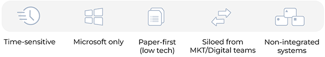
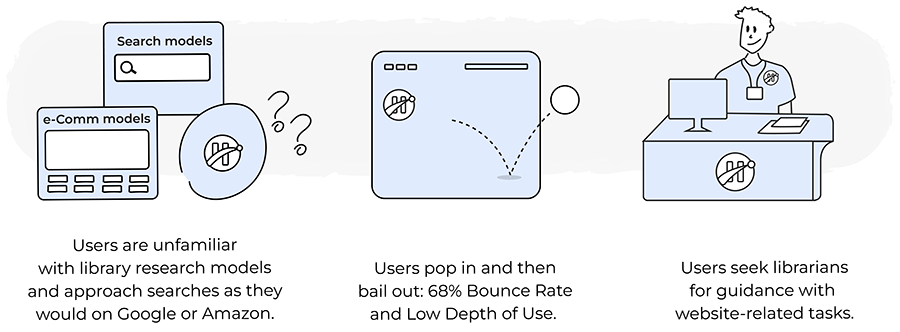
Students navigated disconnected platforms—Humber Libraries, Page1+, Database Lists—while expecting the simplicity of Google or Amazon. With commercial search models in mind, many misunderstood academic tools, expecting instant results and simplified filters that didn’t translate. This mismatch caused friction and confusion. Since the core systems were externally managed, our focus was to reshape how users interacted with the website—improving layout, navigation, and labelling to support intuitive search and discovery.
My Role: UX Researcher
Led research planning, methodology, and facilitation — including material design, participant coordination, qualitative analysis, and stakeholder reporting. Collaborated with a Developer, a Systems Manager, and a Technical Librarian.
Research/Institutional Goals:
( 1 ) Understand user behaviour and needs
(2) Assess anxiety factors and reduce cognitive load
(3) Improve bounce rates, engagement, and usage depth on underperforming pages
(2) Assess anxiety factors and reduce cognitive load
(3) Improve bounce rates, engagement, and usage depth on underperforming pages
Research Process
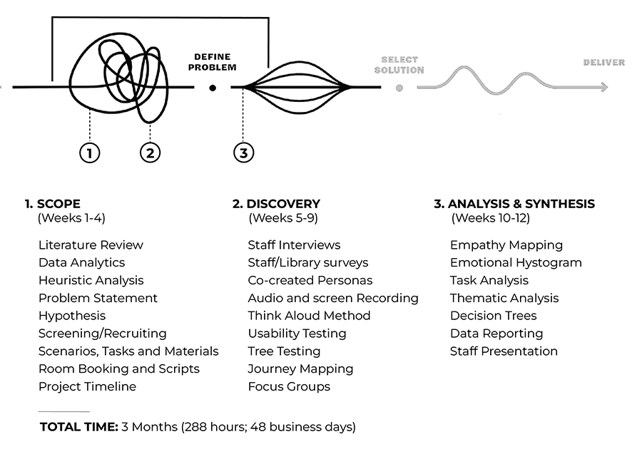
HMW enhance the information-seeking experience to students?
Discovery: uncovering the why behind user behaviour
Key Research Questions (RQs):
RQ1. How logical and user-centred is the overall information architecture?
RQ2. Where is the website falling short in usability?
RQ3. How do users navigate to the information they need?
RQ4. Are user expectations being met?
RQ5. What features do users need most?
RQ1. How logical and user-centred is the overall information architecture?
RQ2. Where is the website falling short in usability?
RQ3. How do users navigate to the information they need?
RQ4. Are user expectations being met?
RQ5. What features do users need most?
See below how each method addressed these questions.
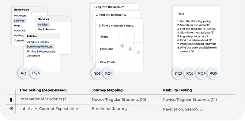
Data-driven decisions, questions and tasks
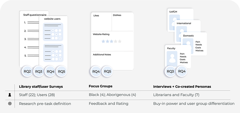
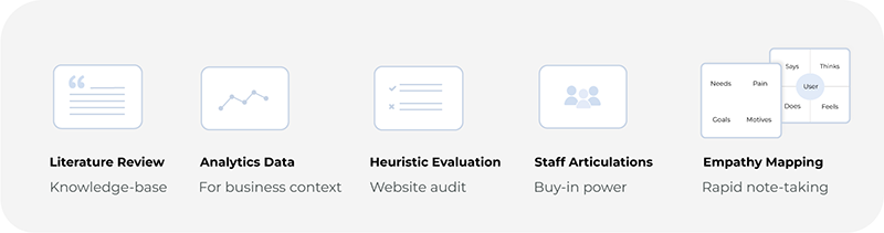
• Analytics data and literature review provided strategic context and surfaced performance issues
• Surveys with patrons, faculty, and staff revealed key themes and tasks
• Surveys guided the development of Journey Mapping, Tree Testing, and Usability Testing
• Patron & Faculty Themes: textbook lookup (10), study room booking (10), Page1+ articles (8), title search (6), find databases (5), research guides look-up (4)
• Staff Themes: Page1+ search (11), content type & database list (9), librarian contact details (4)
Usability Testing: diverse sample and ethical protocols
• Screening ensured representation across user roles, system usage, programs, and campuses—prioritizing desktop users (77%) to reflect real behaviour.
• The sample included Indigenous, International, and Black students, offering inclusive perspectives and surfacing equity-related usability barriers.
• Think-aloud protocols were used during sessions to capture cognitive friction. Participants received clear consent forms and all sessions were recorded with permission, following TCPS2-aligned standards for privacy and confidentiality.
UX Misalignments: where system design failed user expectations
Usability testing and thematic analysis revealed four key areas where the system consistently failed to meet user expectations.
1. Navigation: entry points and access barriers
[ 1 ] Many users arrived via Google, unable to recall the library URL. [2] Dual logos blurred ownership perception, and [3] login paths like “MyAccess” were overlooked. [4] Page1+ filters confused novice users, while [5][6] the ‘Content-Type’ menu—mistaken as a filter—led to repeated errors, delays, and frustration.
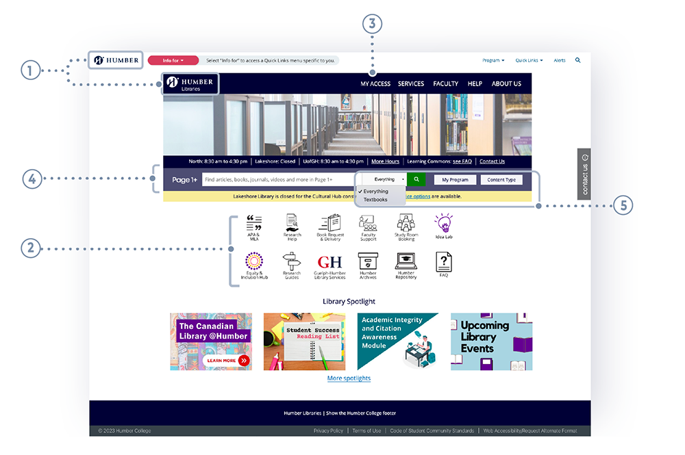
Fig. 1: Library website homepage.
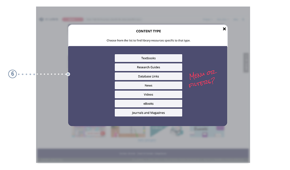
Fig. 2: Home > Content Type (modal menu).
2. Labelling: ambiguity and mismatched expectations
Labels lacked clarity and mutual exclusivity, especially in mid-level navigation. Users often selected the correct top-level link (e.g., “Services”) but got lost navigating subpaths. Influenced by commercial patterns, many expected to find policies under book-detail pages, not buried in separate sections.
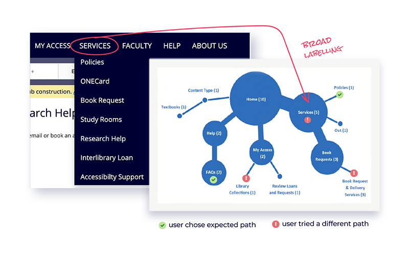
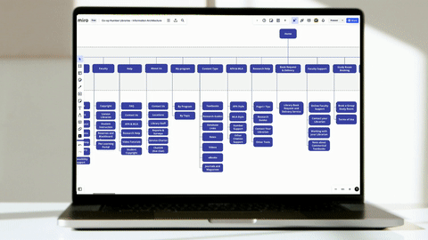
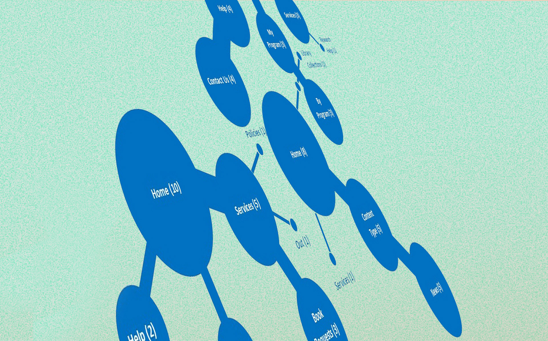
Fig.3: Sample of the tree testing analysis.
Tree Testing sessions revealed how users interpreted menu labels like “Services,” “My Program,” and “Content-Type.” Their feedback informed adjustments by the Design, IA, and Content teams during the redesign phase.
3. Visual Design: inconsistencies and broken standards
Search boxes (Home, Database, FAQ) failed usability expectations, increasing cognitive load. Visual inconsistencies—such as icons, colours, and a missing footer—broke design standards. Login/account features weren’t discoverable, limiting user control and personalization.
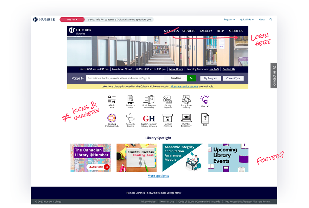
Fig.4: Library website homepage.
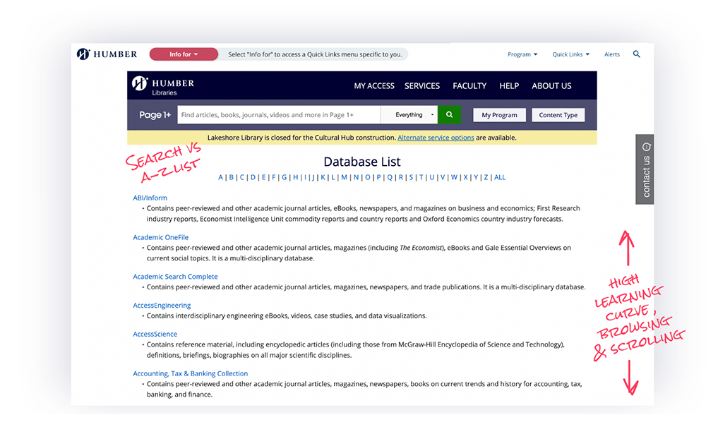
Fig.5: Database Links with user obsetvations.
In the example above, the search bar and database links should not be placed side by side since these are separate systems. Users often preferred to save their favorite links for easy access.

Fig.6: FAQ page with user observations.
4. Help & Support: gaps in guidance and mental models
Renewal and policy details were difficult to locate under “Services,” conflicting with users’ mental models. FAQs were dense, lacked a sidebar or search, and led to early drop-off. Gen Z users showed low tolerance and defaulted to live chat—signalling poor self-service discoverability.
Strengthening UX Thinking: aligning research with system realities
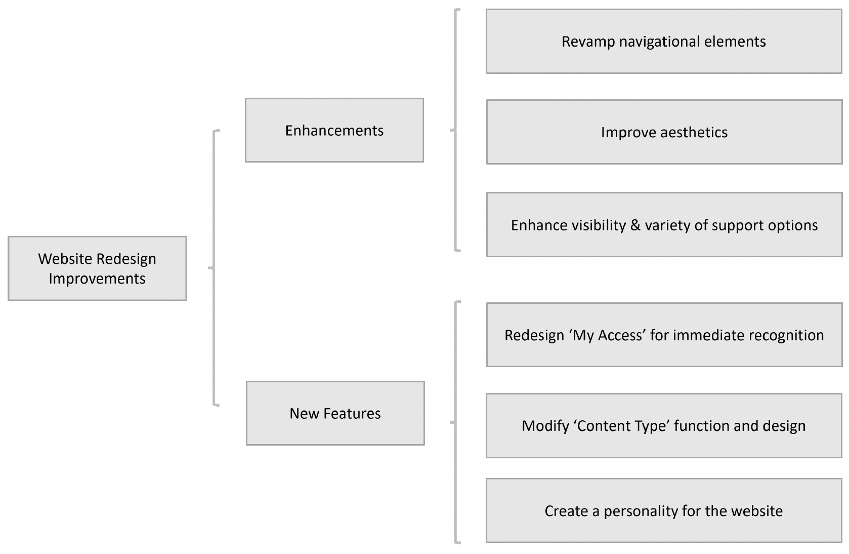
A thematic analysis synthesized findings into four actionable focus areas: Navigation, Content, Layout, and Functionality—anchored in feedback from students, faculty, and staff. These insights directly informed design decisions, contributing to a redesigned library website that is now live and more responsive to user needs.
While system-level constraints remained, the research offered clear direction on how to better support users within those limits—through refined labelling, improved layout, and strategic content placement.
Journey Mapping added emotional depth to usability testing, helping the team better understand how students interact with institutional systems—especially when overwhelmed or unsure.
On a personal level, this project deepened my ability to balance user needs with institutional realities. I became more confident in designing research with impact, asking the right questions, and translating findings into decisions that matter. It was a humbling reminder that even small insights—when well grounded—can drive meaningful change.