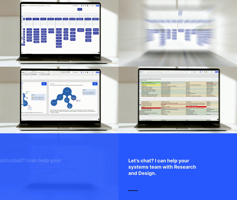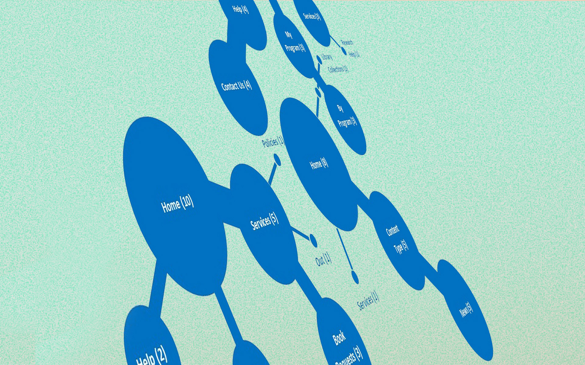
Image: Mental model map, synthesized from tree-testing paths,.
The Problem
Students expected the simplicity of Google or Amazon from a set of disconnected academic tools — the Humber Libraries website, Page1+, and standalone database lists — and the mismatch showed up as friction, backtracking, and abandoned searches. The catalogue and databases were externally managed and out of scope for this project, so the website itself — its layout, navigation, and labelling — was the only lever available for closing that gap.
My Role
As a contract UX researcher, I co-developed the research plan and methodology, then led the task-based testing, cross-method analysis, recommendations, and research visuals — while my project manager led screening, recruitment, and access to participants I didn't have a relationship with as an external contractor. The team produced the final report together, and I shaped and delivered most of the presentation to library staff across Humber's campuses.
Team: Karis de Campos (UX Researcher), with research partners Amanda Van Mierlo (Technical Librarian) and Lisa DiBarbora (Systems Manager), alongside a Developer
Research/Institutional Goals
1. Better understand user behaviour and needs;
2. Reduce library anxiety by avoiding jargon that creates barriers;
3. Improve bounce rate, engagement, and usage depth on underperforming pages
Research Process

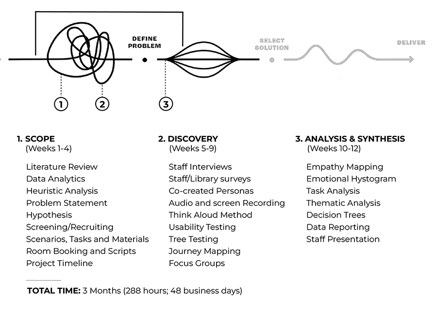
HMW enhance the information-seeking experience to students?
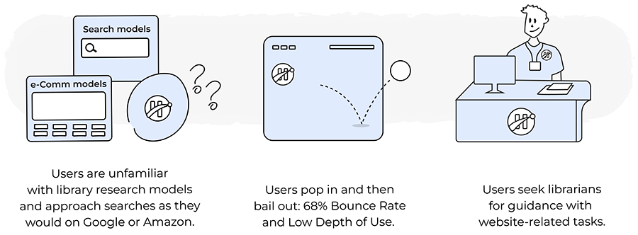
Discovery: turning a 68.96% bounce rate into five testable questions
Key Research Questions (RQs):
RQ1. How logical and user-centred is the overall information architecture?
RQ2. Where is the website falling short in usability?
RQ3. How do users navigate to the information they need?
RQ4. Are user expectations being met?
RQ5. What features do users need most?
RQ1. How logical and user-centred is the overall information architecture?
RQ2. Where is the website falling short in usability?
RQ3. How do users navigate to the information they need?
RQ4. Are user expectations being met?
RQ5. What features do users need most?
Analytics pointed us to the underperforming pages. Literature review and surveys with patrons, faculty, and staff then told us which tasks to test directly. Those combined signals shaped the in-depth interviews, focus group topics, tree testing, journey mapping, and usability testing that followed.
See below how each method addressed these questions.
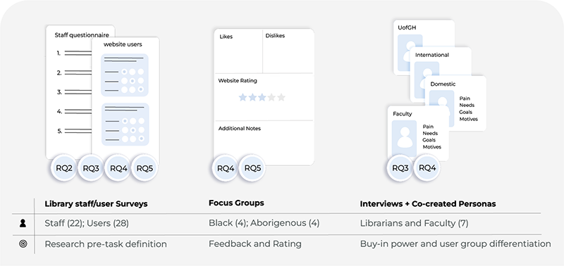
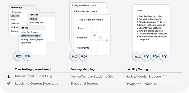
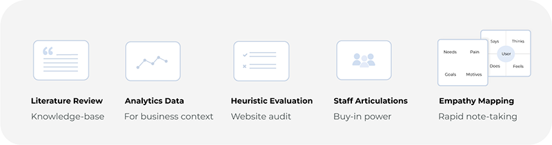
Sample & Ethics: Screening prioritized representation across roles, system usage, programs, and campuses — weighting toward desktop users (77%) to reflect actual usage patterns. The sample intentionally included Indigenous, international, and Black students, surfacing equity-related usability barriers that a more homogeneous sample would have missed.
Think-aloud protocols captured cognitive friction in the moment; all sessions used informed consent and were recorded with permission, following TCPS2-aligned standards for privacy and confidentiality.
Thematic analysis across usability testing, tree testing, journey mapping, and the task scenarios converged on four areas where the system consistently broke from what users expected. The full set of findings is documented in the final report.
What the data told us: four Misalignments
1. Navigation: every click was a guess
Most users left humber.ca and went on Google to find the library page. They were unable to recall the library URL [1]. Dual logos blurred ownership perception [2], and login paths like “MyAccess” were overlooked [3]. Page1+ filters confused novice users [5], while the ‘Content-Type’ menu—mistaken as a filter—led to repeated errors, delays, and frustration [6].
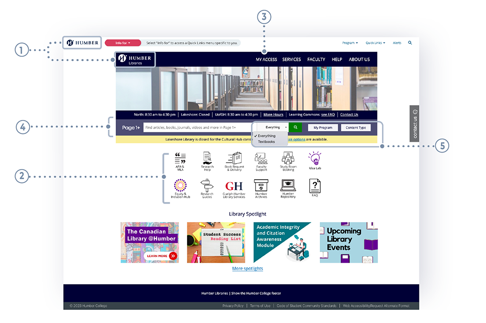
Fig. 1: Library website homepage.
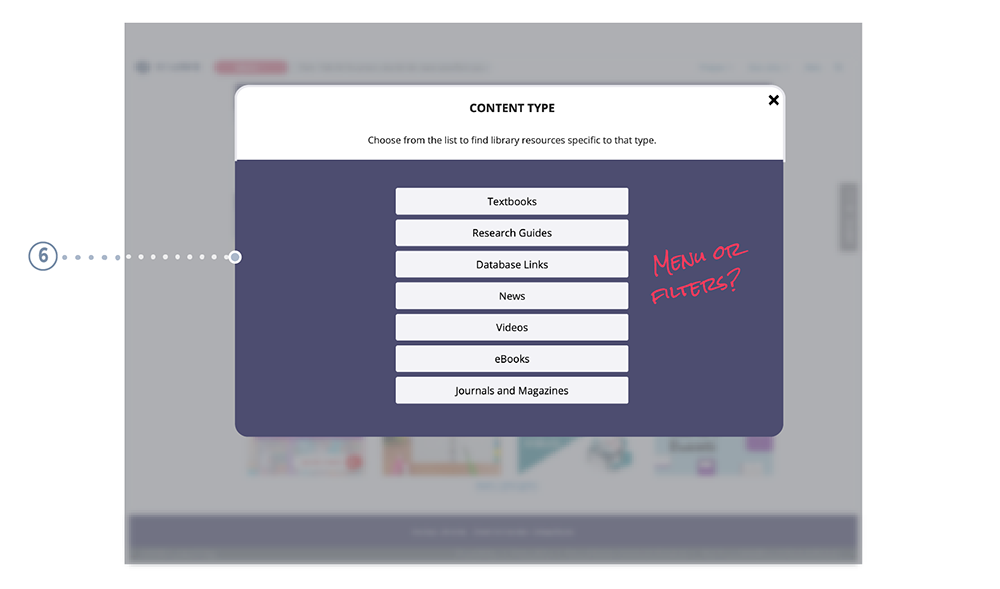
Fig. 2: Home > Content Type (modal menu).
2. Labelling: lack of clarity and mutual exclusivity, especially in mid-level navigation
Asked what content they'd expect under each menu, Users often selected the correct top-level link (e.g., “Services”) but got lost navigating subpaths. Influenced by commercial patterns, many expected to find policies under book-detail pages, not buried in separate sections.
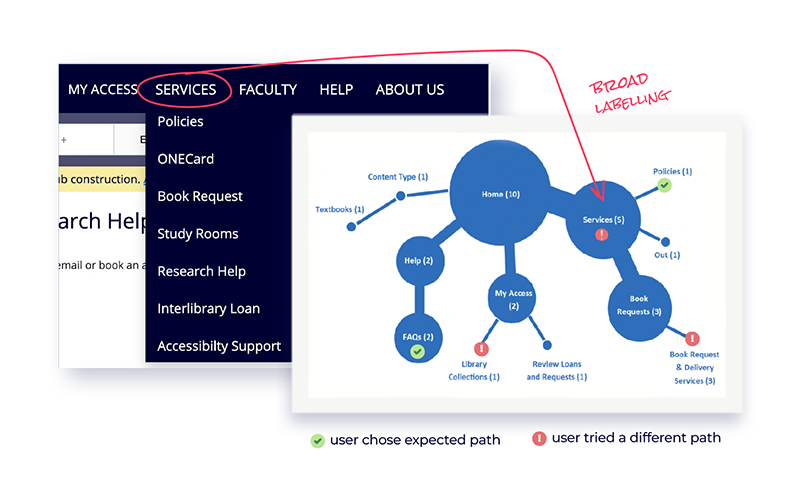
Fig.3: Sample of the tree testing analysis.
Tree Testing sessions revealed how users interpreted menu labels like “Services,” “My Program,” and “Content-Type.” Their feedback informed adjustments by the Design, IA, and Content teams during the redesign phase.
3. Visual Design: inconsistencies and broken standards
Search boxes (Home, Database, FAQ) failed usability expectations, increasing cognitive load. Visual inconsistencies—such as icons, colours, and a missing footer—broke design standards. Login/account features weren’t discoverable, limiting user control and personalization.
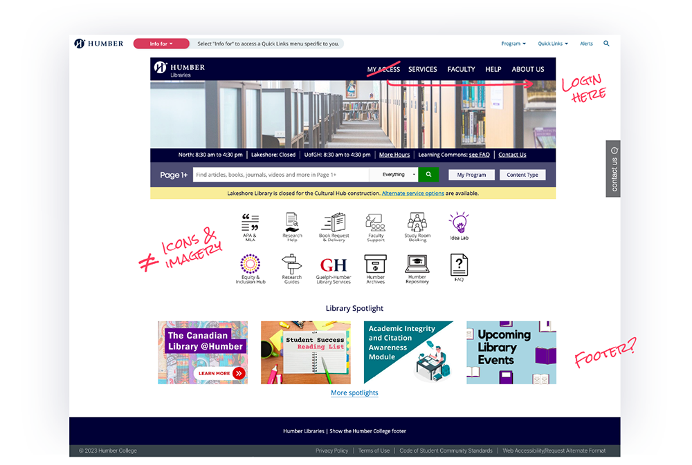
Fig.4: Library website homepage.
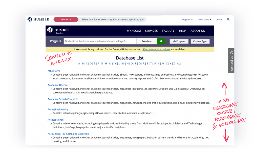
Fig.5: Database Links with user obsetvations.
In the example above, the search bar and database links should not be placed side by side since these are separate systems. Users often preferred to save their favorite links for easy access.
4. Help & Support: gaps in guidance and mental models
FAQs were dense, lacked a sidebar or search, and led to early drop-off. Gen Z users showed low tolerance and defaulted to live chat—signalling poor self-service discoverability.

Fig.6: FAQ page with user observations.
Change was possible — even within the constraints
While system-level constraints remained, the research clarified where change was still possible. Cross-method synthesis led to six agreed directions for Phase 2 (Fig 7), including refined labelling, improved layout, more strategic content placement, and better visibility of support and research-literacy resources. The redesigned site is now live.
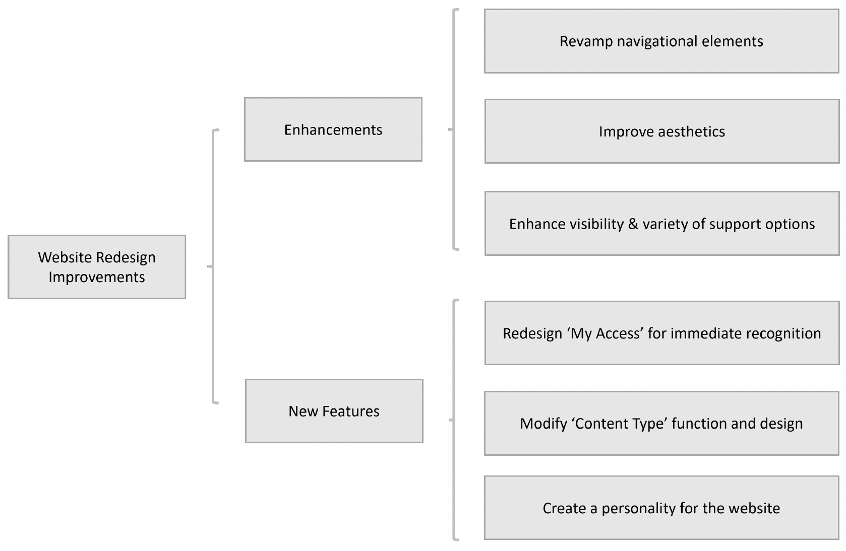
Figure 7. Cross-method synthesis translated recurring findings into six research-backed directions for Phase 2.
The project strengthened my ability to balance user needs with institutional realities and turn complex evidence into actionable direction. Today, I would go further by defining success measures upfront, distinguishing interface issues from broader service problems, and carrying those measures into post-launch evaluation.